
INSIGHTS
May 2026
Executive Summary
April Market Turnaround: Markets reversed sharply from March weakness, with the S&P 500 climbing from -4.37% YTD at March-end to +5.70% by April 30, representing a 10.07 percentage point swing. The QQQ technology index showed even stronger performance, surging from -5.92% to +9.88% over the same period. This dramatic turnaround followed the ceasefire that took effect April 7-8, which allowed investors to refocus on corporate fundamentals.
Golly, what a difference one month makes, right?!
At the end of March, we were quietly celebrating limping into the end of the quarter with flat to slightly negative performance for the year, depending on the portfolio construction. Remembering that we do not manage to benchmarks, we do, however, use benchmarks to inform us if that model construction performs within reasonable expectations. The stock benchmarks ended March 2026 here:
| Index¹ | YTD Total Return (3/31/2026) |
|---|---|
| S&P 500 | -4.37% |
| QQQ | -5.92% |
| ACWI | -2.21% |
| ACWX | +2.00% |
The numbers tell the story that the fighting in the Middle East could hurt the U.S. economy in the future. The economy and the stock market are different things. The stock market acts as a predictor of future activity. The economy measures that activity as it occurs. The table shows declines in the big U.S. companies, notably technology. The ACWI’s negative return can nearly entirely be blamed on the U.S.’s 60% share of that index, where you see positive results without the U.S. in ACWX.
Fast forward one month to April 30, 2026:
| Index | YTD Total Return (4/30/2026) |
|---|---|
| S&P 500 | +5.70% |
| QQQ | +9.88% |
| ACWI | |
| ACWX | +2.00% |
What happened?
The ceasefire that went into effect of April 7-8, provided the headspace for investors to focus on company earnings, which have, so far, been nothing short of spectacular. During the first week of May when Alphabet, Amazon, Meta, and Microsoft all reported along with many others, we witnessed estimates rising daily from the start of the week from 17% to week’s end at 21.7% for growth in S&P 500® earnings for 2026.
Most of that surge was driven by those big Tech companies. Within this cohort, there were significant boosts to Google, Microsoft, and Amazon net earnings for increased valuations of their investments – presumably in OpenAI and Anthropic, among other things. Nonetheless, operating earnings were strong across the lot.
Bonds lagged with the 10-year Treasury beginning the month at 4.35% and ending at 4.40%. The 2-Year action was more dramatic, backing up from 3.81% to 3.91% over the same period, but having less price effect due to the shorter duration. Basically, accrued interest offset the negative price movement for a flat month of return. Credit spreads tightened, which did provide some positive return for non-Treasuries. The AGG 2 , which is nearly half Treasuries, was up just 11 bps for the month.
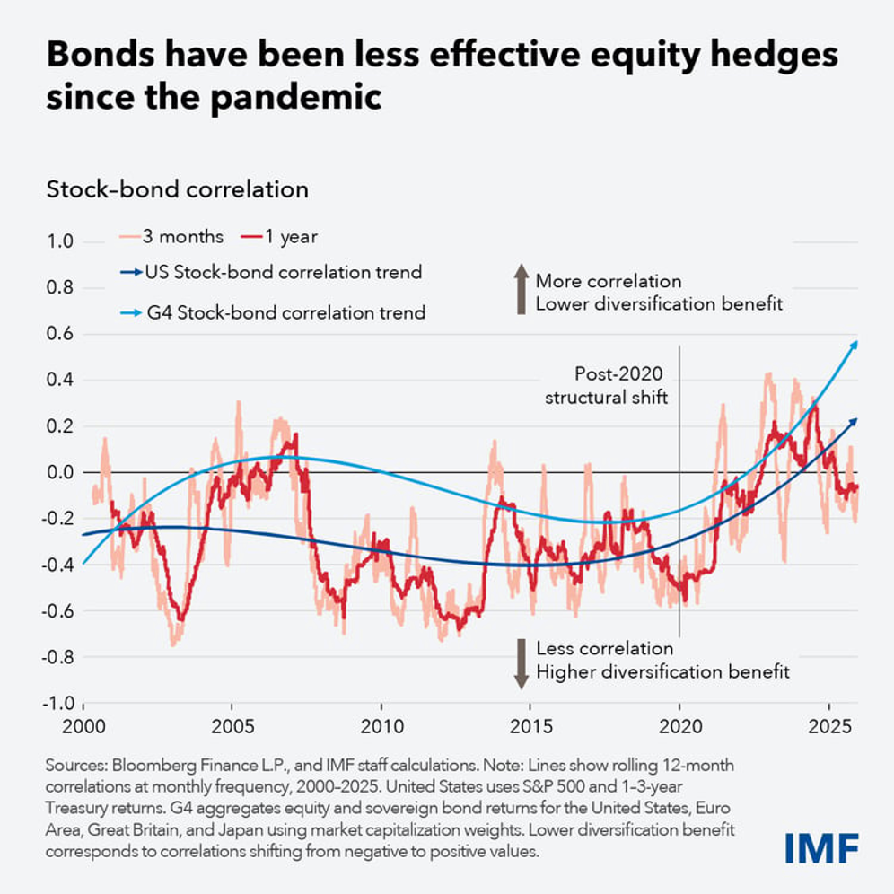
Five years ago, our investment team noted the tightening correlation between movements in stock and bond prices. Prior to 2020
3, bond prices and stock prices moved differently than at present. Bonds tended to decline in value when stock prices rose, and vice versa. Since 2020, the portfolio modeler might feel lucky if bonds stay flat while stock prices go down, as both stock and bond prices going down at the same time is no longer unusual.
In mid-2021, we added our first “Alternatives” sleeve to our portfolio models. We began by defining Alternatives or “ALTs” for short as holdings whose returns correlated less than 0.7 to EITHER stocks OR bonds 4 . Over the years we have worked to construct what we believe to be a robust subset in this sleeve, which we want to zig when the other pieces zag. ALTs proved a key factor in defending our models during 2022 when both stocks and bonds cratered.
Liquid alternatives have provided positive results YTD in portfolios, continuing to offer not just ballast as is their primary purpose, but also material contribution to returns – continuing the trend from 2025. For example, in our model with a fairly neutral 50% stock allocation (Model 5S) to its benchmark index, the 15% allocation here returned +2.11% for the month of April alone before our fee. That model as a whole returned +5.23% gross, or +5.06% net of our highest published fee – just for April. You can judge just how important the inclusion of ALTs was to that particular model.
Final point to make here, we played good defense in March to allow our models to jump ahead of benchmarks in April. While we manage to targets and not to benchmarks, being ahead of benchmarks informs us that our probability of success due to how we fit the pieces of each model together remains intact.
- The S&P 500® Index measures return performance of the 500 or so largest companies in the U.S. by market capitalization (said another way, the higher the company is valued in the market relative to other companies, the higher its percentage share in the index). QQQ measures performance for the top 100 companies listed on the NASDAQ exchange and dominated by technology companies. The ACWI, which is the MSCI All Capitalization World Index and is our primary stock benchmark because it best fits our investment opportunity set in the asset class, is roughly 60% U.S., 26% Developed markets outside the U.S, and 14% Emerging markets. You may have guessed that ACWX is the ACWI without the U.S.; so 78% Developed without U.S., 22% Emerging.
- “AGG” is short for the Bloomberg US Aggregate Bond index, as well as the ETF that has that ticker symbol, which includes U.S. Investment-grade taxable bonds. The index is weighted according to amount outstanding; thus, no surprise that U.S. Treasuries comprise around half the holdings as the Treasury is the largest debtor in the U.S. (and the world).
- Recent studies from major financial institutions highlight a structural shift in the relationship between stocks and bonds. Since 2020, the traditional inverse correlation (where bonds act as a hedge for stock selloffs) has tightened significantly, with both asset classes increasingly moving in tandem. Here are the key studies and findings from the last five years (2021–2026):
- The IMF: Diminished Protection from Selloffs (2026)
In a February 2026 report, the International Monetary Fund (IMF) identified late 2019 as the turning point for correlations. - The Shift: From 2000 to 2019, an inverse relationship was the foundation of diversification. Since 2020, supply shocks and inflation have caused bonds to move in tandem with stocks, failing to cushion volatility.
- Drivers: Expanding bond supply to finance fiscal deficits and sticky inflation have heightened risk premiums, making bonds behave more like risk assets than hedges.
- Morningstar: Inflationary Regime Effects (2026)
Morningstar’s 2026 Diversification Landscape report confirms that while long-term correlations (1960–present) average 0.08, the recent upturn is pronounced. - The "Inflation Floor": Morningstar notes that periods of high, protracted inflation (double-digit or lasting 3+ years) are the strongest drivers of positive correlation.
- Findings: Rapidly shifting interest rates and inflation since 2021 have led to a "pronounced upturn" in correlations, with rolling three-year figures moving well into positive territory for the first time since 2000.
- Oxford Economics: The Positive Correlation Regime (2025/2026)
Research from Oxford Economics predicts that the pre-COVID regime of weakly pro-cyclical inflation will not return soon. - The "New Normal": Their Global Outlook 2026 argues that activist fiscal policy and geopolitical risk will keep correlations positive through 2026.
- Impact: They warn that traditional asset allocation models (like the 60/40) will face persistent challenges as government bonds provide less ballast to portfolios.
- J.P. Morgan: The Post-COVID "Market Frontier" (2026)
In their 2026 Mid-Year Outlook, J.P. Morgan analysts suggest that the correlation between stocks and bonds is now "structurally higher." - Systemic Changes: The study points to "rolling shocks" (energy, AI, and fragmentation) as the new reality.
- Advice: Because both asset classes may fall together during inflationary shocks, they argue that alternative assets are no longer optional but a "strategic necessity" for modern portfolios.
- Summary Table of Drivers (2021–2026)
- Driver: Inflation Shocks
- Mechanism: Both assets react negatively to rising discount rates.
- Evidence Source: Morningstar
- Driver: Fiscal Deficits
- Mechanism: Massive issuance increases term premiums on bonds.
- Evidence Source: IMF
- Driver: Monetary Policy:
- Mechanism: Rapid rate hikes since 2022 hit both equity valuations and bond prices.
- Evidence Source: U.S. Bank
- Driver: Geopolitics
- Mechanism: Supply chain fragmentation fuels price volatility in both sectors.
- Source: Oxford Economics
- Correlation scales from +1 to -1. +1 indicates prices move in identical directions, -1 in opposite directions, and 0 means price move independently of each other. +0.7 indicates a moderately strong relationship which can be further refined by the “coefficient of determination”, calculated as
r
2 , where
r is the correlation: (0.7)
2
= 0.49. This means that approximately
49% of the price changes in one asset can be explained by the price changes in the other. The remaining 51% is influenced by independent factors unique to each asset.
in by you. Index performance is also for illustration only, to provide a relative comparison for the model portfolio. Index performance does not reflect any management fees, transaction costs or expenses.


